Welcome to Moda Fabrics!
Playing With Color
Playing With Color
Published:
Jun 23 2022 - 08:05
Today, we are welcoming Robin Pickens as our guest. Robin is a multi-faceted designer dipping her toes in many platforms. We first discovered Robin as the winner of a design contest that we partnered with Spoonflower in 2016. Robin explores a different series of flowers with each fabric collection, as she mentions throughout this post. Robin has also become one of the weekly highlights in Moda's Blockhead 4 project. If you are unfamiliar with Blockheads, a Moda designer shares a quilt block pattern each Wednesday on their blog and in the
Blockheads FB group. Robin then shares a color study using the featured block, expanding our thinking of color and design. Enjoy!
Playing With Color
I’m excited to share a little color talk on Moda’s blog today!

It is not a secret that I like color. I like combining colors and creating a mood from the mix of warm and cool and thinking of what accent colors will add visual interest and energy. One interesting thing about my background is that I went to the University of Michigan School of Art and earned my Bachelor of Fine Arts (concentrating on Graphic Design and Industrial Design). Yet, I never once took any color theory classes there! It wasn’t intentional but more the way my schedule worked out each semester. I do understand the color wheel and how colors mix and blend. And all the technical terms like hues, tints, tertiary, complementary, etc. But I often think my color play is more instinctual and influenced by what I see around me that is lovely and noticing what feelings those colors evoke. As an artist and designer, I feel like each time we make a quilt, we have a canvas of fabric in front of us and are composing our own art with shapes and colors.
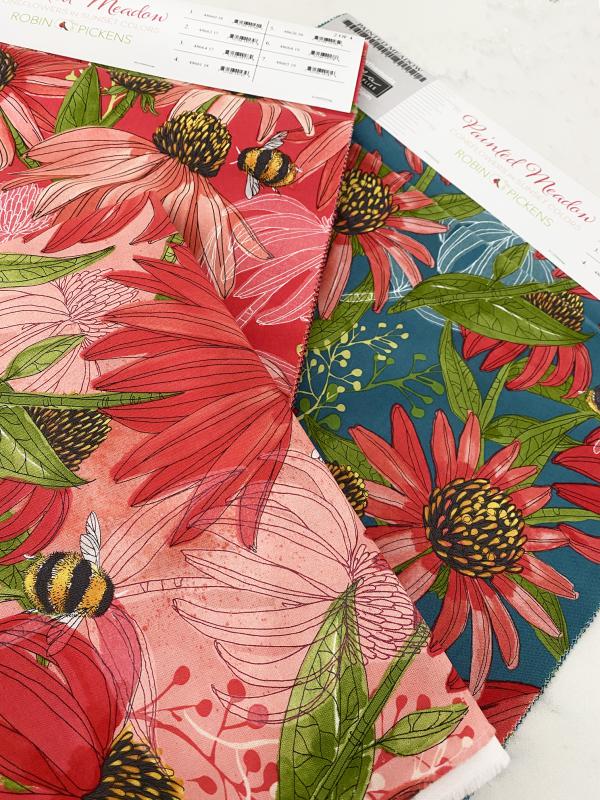
When I design a fabric collection, I think of a palette of colors that will work together and create harmonious combinations. When I am creating a floral collection, nature is my guide and provides lots of inspiration for beautiful blush pinks, deep reds, leafy greens, cheery yellows, and more. All those colors are blooming in splendor! So a collection is heavily influenced by that family of flowers. But more drama and interest are added by finding colors that provide the backdrop to the blooms. The reds and peach tones of coneflower are luminous when paired with a deep teal background. That is contrast. The same coneflower looks softer when sitting on a pink background. That is complimentary.


Playing with color is often about balance. I like to have groups compliment and go WITH each other, like the range of colors in each stalk of the Rainbow Beanstalk quilt or all those warm, rich colors in the Thatched version of Stitch Pink.
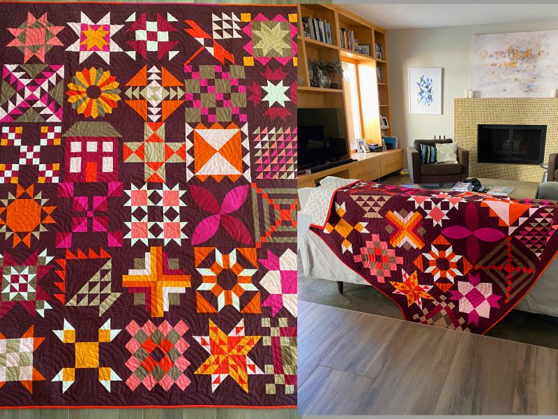
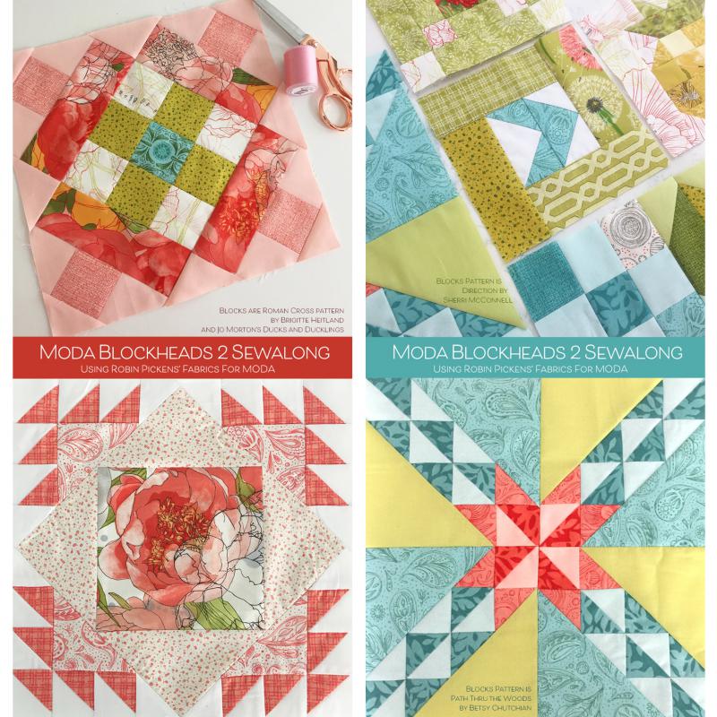
I also like to put in a pop of something from the other side of the color wheel for contrast. In the Moda Blockheads 2 quilt, I used fabrics from Dear Mum, Blushing Peonies, Dandi Annie, and Poppy Mae. When I had a block with many pinks, sometimes I would put in an accent from the turquoise/teal family (top left image). Or similarly, with a turquoise block, put in a pink center to add contrast in color (lower right).
If you are working with a fabric collection and its full range, chances are the designer has worked to make a pretty palette to guide you on your way. You may want to add in some more solid colors (or I might suggest my Thatched basics!) to boost up a bigger percentage of your preferred colors in the group. When you make a quilt with a white or cream background color, the primary color expression of the quilt will be about the print fabrics you use in your blocks. If you change that background color to something dramatically different than white, you get an entirely new feeling and mood to the quilt based on that background color. This color of Green Curry, stock #48626 177, from Thatched makes this Criss Cross Kisses quilt with Carolina Lilies look SO different!
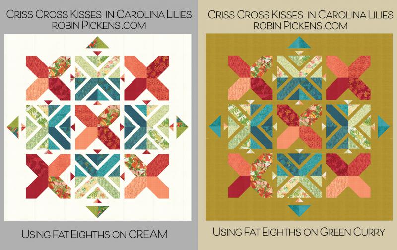
Criss Cross pattern, stock # RPQP CCK140
When planning a quilt, I often think about the main focus of color and the feeling I want that quilt to have. Is it calm and quiet? Is it dramatic and sophisticated? Is it happy and summery? These “personalities” come from the colors and combinations, how saturated they are, and whether they are warm or cool, light or dark. When working on the Sampler Spree sew-along last summer, I wanted to make my whole quilt about blues and light radiating from the center. I used the Cottage Bleu collection with hydrangeas and focused primarily on the blues within the collection, using the greens and yellows as little accents. I worked on blocks with a tighter range of contrast within the block so a block would exist in a light part of the quilt, a medium-range part, or a dark part but using fabrics that had more of those lights and darks in their colors. It is clear this quilt celebrates BLUE, and I like how the yellow butterflies make little sparkly pops of color in contrast. Just a touch… but the focus of the color is more about a single-family and ranging from light to dark.
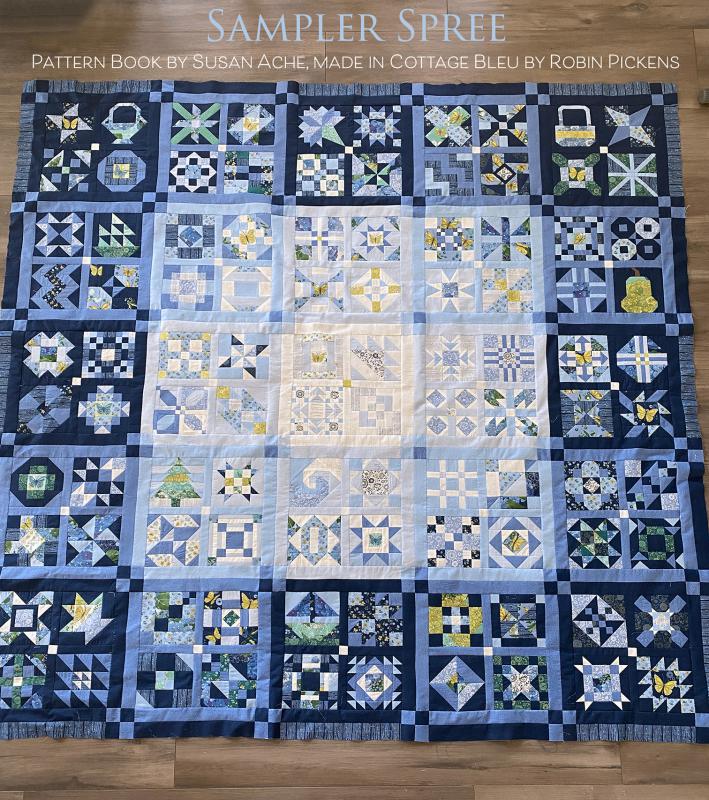
Sampler Spree by Susan Ache book, Stock # B1566

Sampler Spree is on display at the Quilt Emporium, the quilt shop closest to my home in Woodland Hills, California. In front, two bundles of Thatched show some of the color groupings I was playing with for Moda Blockheads 4 suggestions.
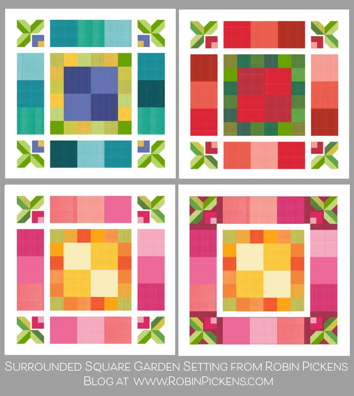
My thought for Moda Blockheads 4 was to share a setting idea emphasizing color arrangement. I’m using the 9” blocks in the center and outer square ring and the 4.5” blocks in a square ring around the center blocks. Each of these square rings and center has a color family. I’m using scrappy fabrics and Thatched for my quilt. My original blog post with the setting ideas is here:
https://www.robinpickens.com/blog/quilt-sampler-using-free-blocks-with-moda-blockheads

I am making the pink, orange and yellow ones with the feeling of happy summer! I have leftover pieces of Abby Rose, Solana, Painted Meadow, Tulip Tango, and other collections to use for my prints. I’ve been asked how I make my colors look cohesive with my scrappy fabrics, and I try to pick prints from the same color families. However, a big part of telling my color story involves choosing a palette of a range of colors, usually from my Thatched Basics, with light to dark shades. When I can weave these more solid-looking color prints with my floral prints, it blends the blocks to tell that color story. It is as if the Thatched is a bridge to make the blocks look more uniform in their color scheme.

On my Moda Blockheads 4 quilt, in the outer square ring, I have also decided to use the Cranberry Thatched color, Color #48626 118, as the BACKGROUND to visually “frame-up” the square layout. So instead of using Cream Thatched, as I do for other rows, I’m using Cranberry for even more separation and punch of color. Since I’m making my corner berries in Fuchsia, I wanted to mix the Fuchsia color in little bits through other blocks for an added pop of that hot pink energy.
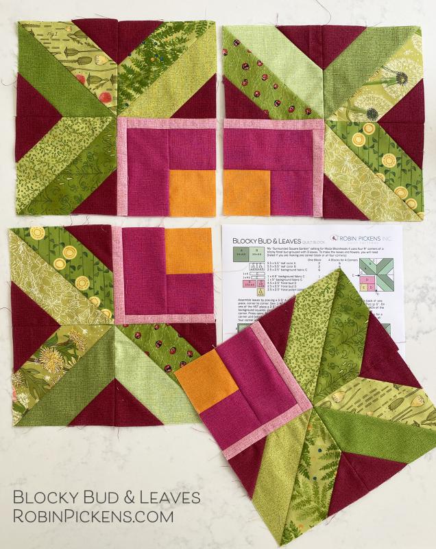
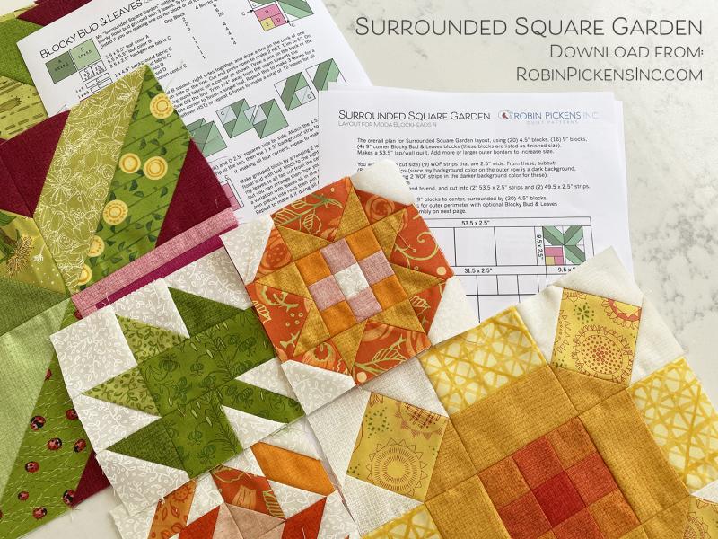
Speaking of the corner blocks, it IS about halfway through, and I have my pattern ready! I’m calling the corner units “Blocky Bud and Leaves.” The instructions for piecing my Surrounded Square Garden setting is also prepared and available. You can check out my blog post for more info at www.robinpickens.com, and you can download these free from my shop at www.robinpickensINC.com (along with other fun things in the freebies section!)

While you are on the blog, there is a page listed in the bar at the top (you need to be on the blog and not just in the shop) that is called COLOR STUDIES. Each week I take the block that the designers have provided and play with it a little with color placement, light and dark, to see how it can change. It has been an enjoyable exercise, and you can visit the past blog posts with my color studies by clicking on the image on this page.

I mentioned the Quilt Emporium with the color bundles. They are making a Moda Blockheads 4 Surrounded Square Garden with scrappy fabrics using the blue/green/purple Thatched color bundle. These are a few of their blocks and how they have woven the Thatched colors in with other prints to make that cohesive color story. I’m so excited to see these blocks pop up in the back classroom of the shop!

One last thing to share on color before signing off. Last year, for Moda Blockheads 3, I wanted to focus on color in rainbow rows. I made all my blocks the same size and worked with light to dark shades within the color rows to make a sort of ombre effect. I did two quilts with the same color plan- one mixed with prints and one in all-Thatched. I’m happy with the resulting rainbow rows, and this was my jumping-off point as inspiration for this year’s Surrounded Square Garden layout with color emphasis for the rows.

What’s your favorite color family? Do you like loud and super-saturated colors or icy light whispery shades that suggest just a splash of color? Are you a lover of red or deeply committed to blue? Does the thought of orange in a quilt excite you or make you run the other way? Try combining some of those unexpected little color accents into your regular “go-to” colors and see how you like them. Have some fun and let yourself play with color!
If you want more color time with me, I have two half-day workshops at Quilters Gathering in August in Berlin, Ohio. The wonderful Corey Yoder of Coriander Quilts will also be doing a trunk show and classes. Come and join us!
https://www.quiltersgatheringinberlin.com/classes
I hope you will follow me on Instagram @robinpickens, on Facebook at RobinPickensColorandQuilt, or by checking out my blog at robinpickens.com.
Shopping for patterns, ask for my patterns at your favorite quilt store or at robinpickensINC.com.
Here is a link to my color card to see the entire lineup of my Thatched basics.
Comments