Welcome to Moda Fabrics!
A Quilt of a Different Color
A Quilt of a Different Color
Published:
Sep 18 2019 - 04:00
Where do you start when you’re dreaming up a new project? Finding a pattern? Falling in love with a fabric line? Like me, you probably never start just one way--usually some kernel of an idea based on one or the other (fabric or pattern) then a long process of obsessing over all the possible ways to bring that idea to life. If I had my way, every quilt I ever made would start with Coral Rose from the Bella Solids. Not that there’s anything wrong with sticking to what you love, of course, but it is sometimes nice to push out the wagon and try something new.
Which is what brings us to what will be a series all about...
If I’m ever feeling in a rut or like I need a new challenge, I like to bring things back to basics and explore with color. Because I’m a graphic designer at heart, doing the fabric pull is nearly always my favorite part of the quilting process. What is it about finding that perfect balance of light and dark, low and high volume that will make your whole day brighter? I don’t know, but it really does.
So in the spirit of National Sew a Jelly Roll Day this Saturday, I thought I’d share a few mockups from one of the next projects in my queue--Mountain Climbing by Betsy Chutchian from Moda All-Stars' On a Roll. It’s already such a striking quilt as designed by Betsy, and I knew that it would be a great display for fun color.
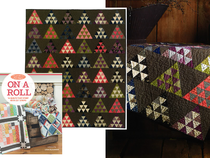
Really committing to a fabric pull is so tough sometimes, so I usually get started with a rough mockup on my computer once I pick a pattern, just to see how I’m liking the colors I pull together. As a bonus, it’s easy to switch things around and you might just find that the crazy orange you wanted just in places is actually GREAT as a background for the whole project! I love customizing fabrics for a project based around precuts, as, like this pattern, it's so simple to substitute in 2.5" strips in place of Jelly Roll strips while planning things out.
So without further ado...
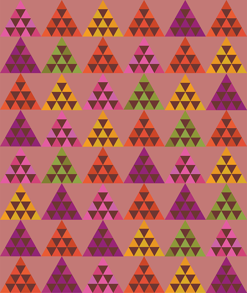
I love the mix here with the Coral Rose background and the bright almost tropical colors for the blocks. Something so simple as swapping the darker background and lighter inner-triangles from the original design can completely change the feeling of a quilt even while the focus is still on the mountains. Berrylicious!
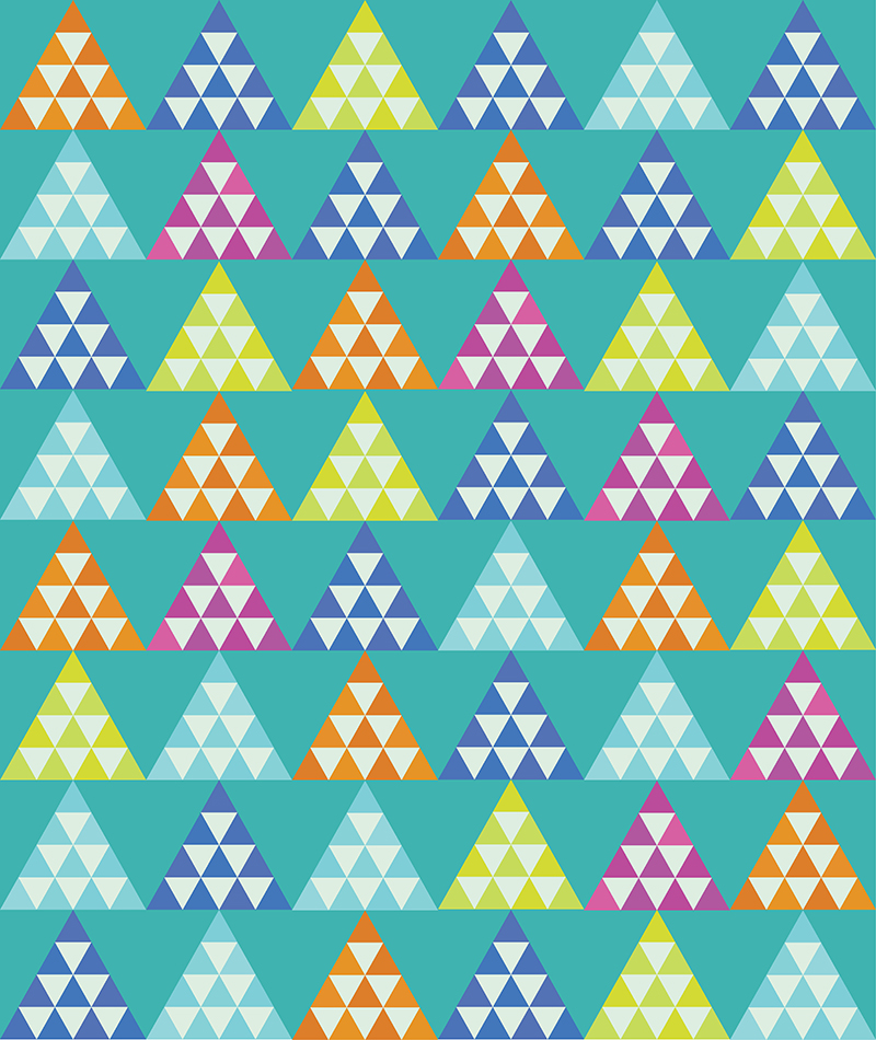
From the tropics to happy brights! I’ve been feeling lately like I’ve been gravitating to warm colors, so this color palette was all about finding a middle ground and bringing in some cool blues and limes to play with the orange and pink.

For this last pull, I wanted to develop a softer combination that would work for really any recipient! It’s no surprise to me that once I put it all together, it strongly resembles Gingiber’s Savannah collection, which I just loved when it was first released. So often baby quilts get termed ‘gender neutral’ so long as they’re not PINK or BLUE, but this is a lovely soft palette that truly could work for any new baby!
So what's next in the wide world of color exploration? Get thee to your local quilt shop of course! For myself, once I find a concept I like just using color swatches in Adobe Illustrator (or EQ8 or Canva or if you're even more hardcore than I am--a hand drawn or painted sketch!), I bring a print out or screen capture of my idea and get to browsing to pull actual fabrics. Hopefully this post has brought you exactly what I use this for in my design process--inspiration. Because once you light that spark, it gives you room to be surprised by what you pull once you start looking at fabric on the bolt.
Posted in:
Comments